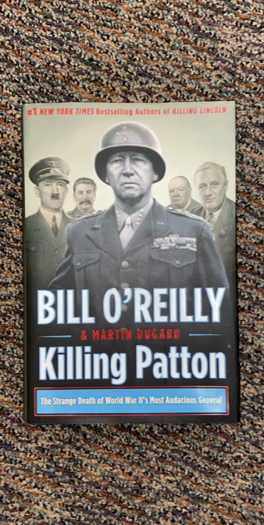
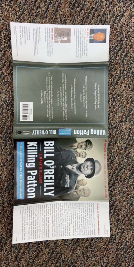
A. The major design components are the image on the front cover of the men and the large bold text listing the authors and title of the story.
B. The focal point is on the center man on the cover especially because he has a glowing effect and he is brighter than the others as well.
C. The text stands out from everything else with the light blue, red, and white colors that it includes while the background is a tanish color.
D. The color in the text is used to make it pop and stand out from everything else while the color not with the text gives the image an old and serious feeling.
E. The main thing that makes my eye “travel around the design” is the glowing effect that the man in the center has which makes him stick out so much.
F. I honestly would not say that this design is very organized. It has some components that work well together but I do not believe that it all goes well together as a whole.

